On Old Computers
The original Macintosh shipped with a screen that was 512 by 342 pixels, one bit deep. Black, or white. That constraint produced some of the most legible, characterful interface design we’ve ever made.
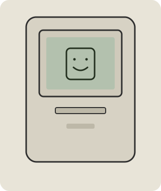
Constraints as a gift
When you can’t lean on color, gradients, or blur, you’re forced to be clear:
- Strong outlines. A window is a crisp rectangle, not a soft suggestion.
- Real estate is precious. Every pixel of chrome has to earn its place.
- Direct manipulation. You move the thing by grabbing the thing.
None of that is nostalgia — it’s good design that happens to be old.
What I kept, what I changed
I didn’t want a museum piece. So this OS keeps the posture of the classic Mac — the menu bar, the close box, the spatial Finder — but rounds the corners, uses a crisp modern typeface, and lets color in where it actually helps: a selection, a link, a photograph.
The goal isn’t to look exactly like 1986. It’s to feel as calm and direct as 1986 did, with the comfort of now.